Final App Video
Final app video demonstration:
The app summary can be found through the youtube link.
Final screenshots:
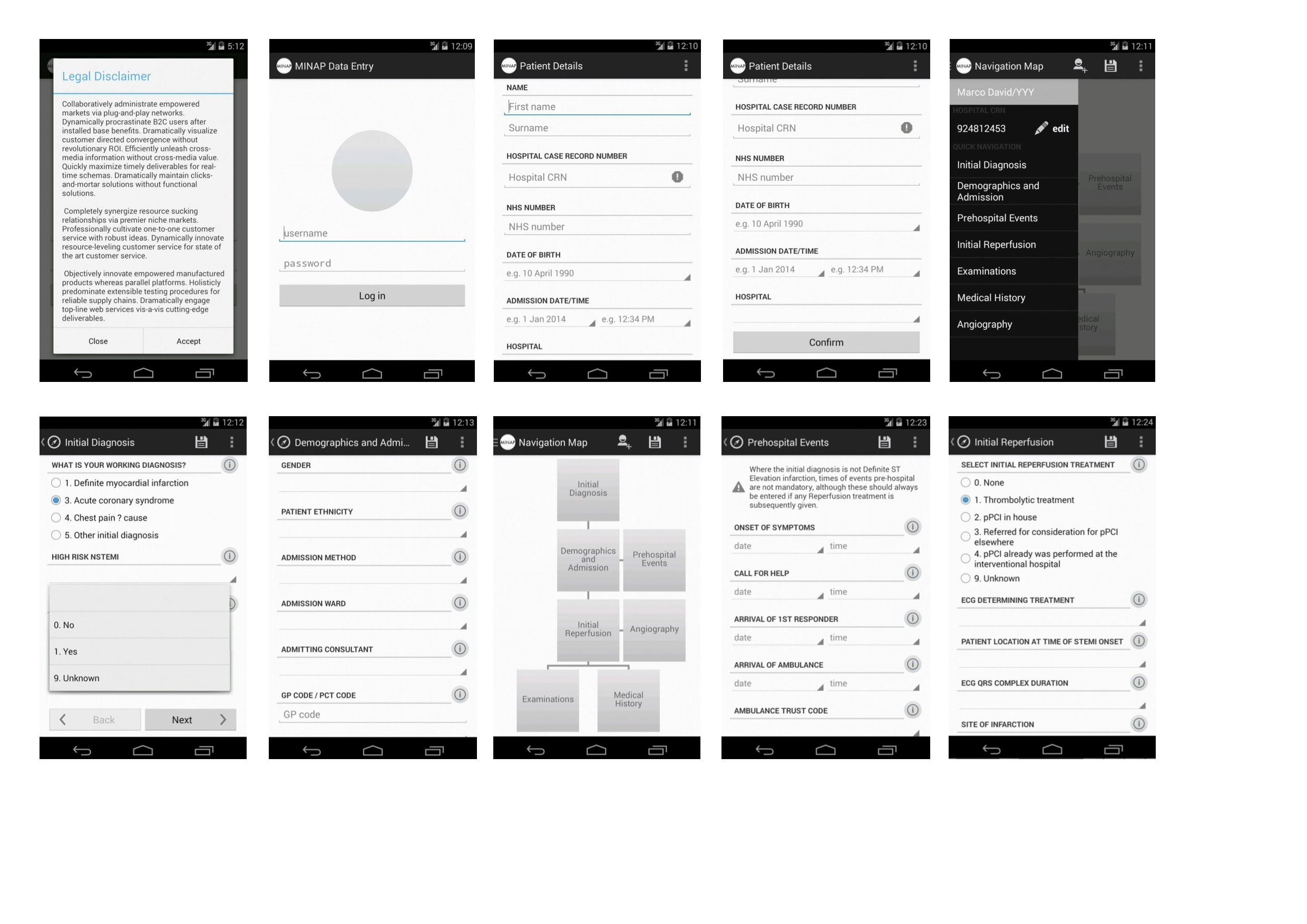
Final app video demonstration:
The app summary can be found through the youtube link.
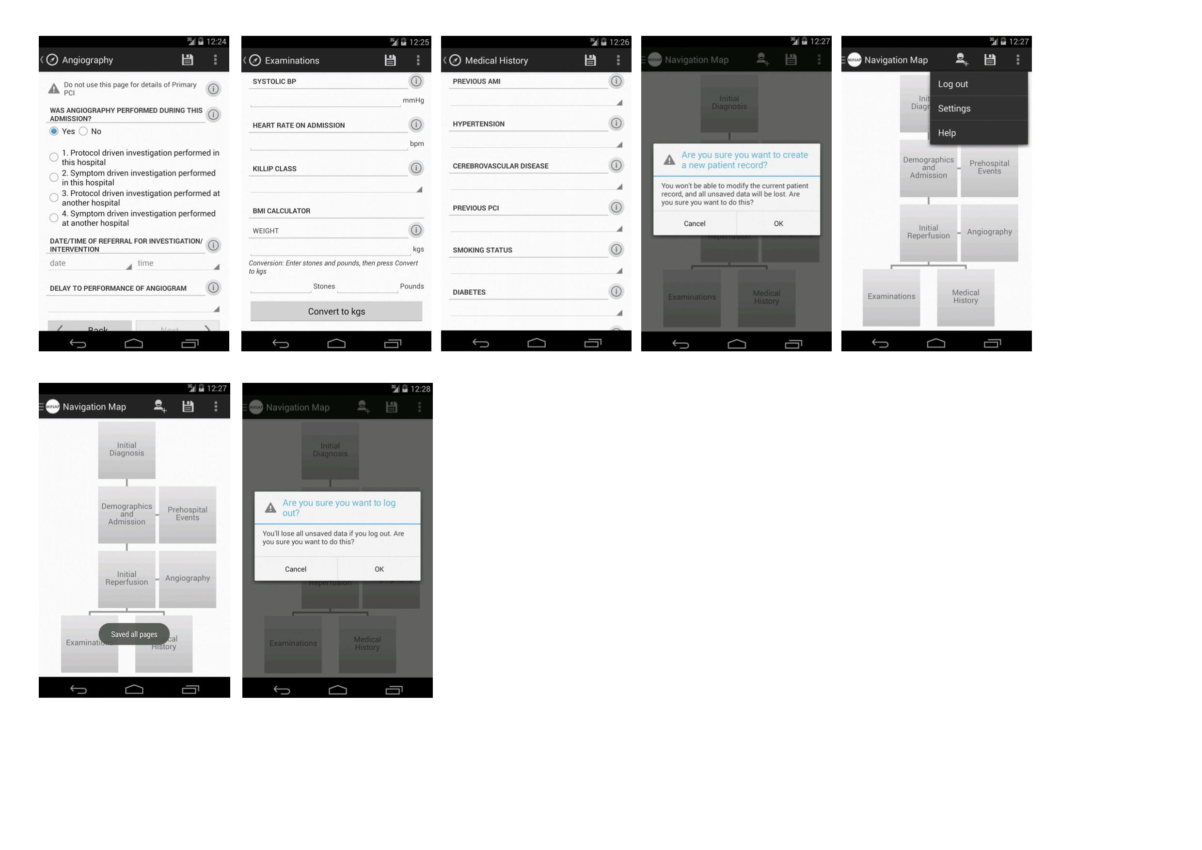
Final screenshots:


The tasks with which I assigned the team and myself to base our heuristic evaluations around are as shown below:
These were based around tasks which were commonly discussed by our client during meetings. It should be noted however that due to time constraints, not all of our target features have are visibly completed – but the functionality exists in the raw code (needing to be “wired up”).
Android’s action bar helped give a space for each page to be given a label, and so it’s pretty easy to see where in the app the user is with a quick glance. However, one important sub-task that is currently lacking any visual indicator is saving. In the early stages of paper prototyping, I intended the save icon to change colour on first click, indicating that all items on the page have been saved – and disabling it from being touched again. Changing an item would then revert the icon to its original state. This would significantly reduce behaviour such as pressing the save button several times, in fear of losing data (which our client admits to doing).
In designing the application, I ensured that most – if not all – key pages are accessible within 3 taps. This was made possible by allowing the navigation drawer to be accessed from all data entry pages within the app. However, as I have noticed in preliminary user feedback from colleagues and our client, accessing the Patient Details page to correct a value was not entirely intuitive, and could be improved.
Unfortunately, the system does not prevent you from “submitting” an incomplete record at present (MINAP requires the completion of 4 mandatory fields before submission). This was primarily due to lack of time to integrate this business logic, but is admittedly a key feature for MINAP.
Data destroying activities such as discarding bad entries are however accompanied by easy to understand warnings before being carried out.
The app looks absolutely brilliant for its purpose as a proof of concept app. The grey look was kept to allow for future styling by MINAP after the application has been fully handed over. I’ve also found that people can spend hours trying to decide how things should be coloured and how images should look – something I decided to avoid in creating the app design.
Of course, I’m biased…
The following evaluation is based on Nielsen’s 10 principles of heuristic evaluation:
The system should always keep users informed about what is going on, through appropriate feedback within reasonable time.
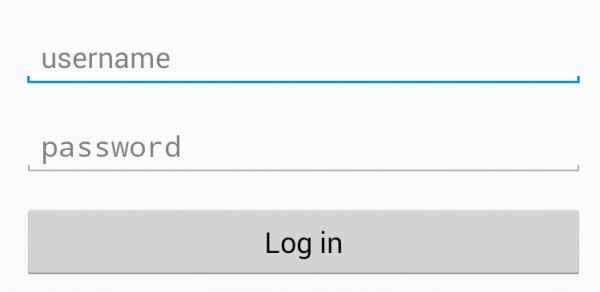
The box that was clicked by user will be highlighted with blue line, makes it easier for user to know where they have selected
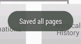
A feedback message is displayed when an action is performed, in case, when save button is clicked, the app will save completed fields and give feedback to user.
The system should speak the users’ language, with words, phrases and concepts familiar to the user, rather than system-oriented terms. Follow real-world conventions, making information appear in a natural and logical order.
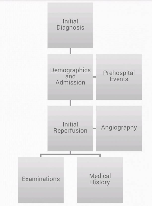
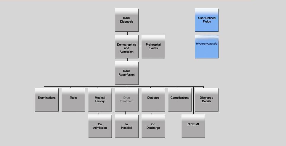
The design of navigation page on the app is very similar to the one that the current MINAP web solution has, expect the simplified structure, the essential feature which is the tree diagram was kept, and the logical relations between pages are inherited as well. For those who are new to our app, they can easily find their way by using the familiar navigation page.
Navigation page on the app
Navigation page on the old web solution
Users often choose system functions by mistake and will need a clearly marked “emergency exit” to leave the unwanted state without having to go through an extended dialogue. Support undo and redo.
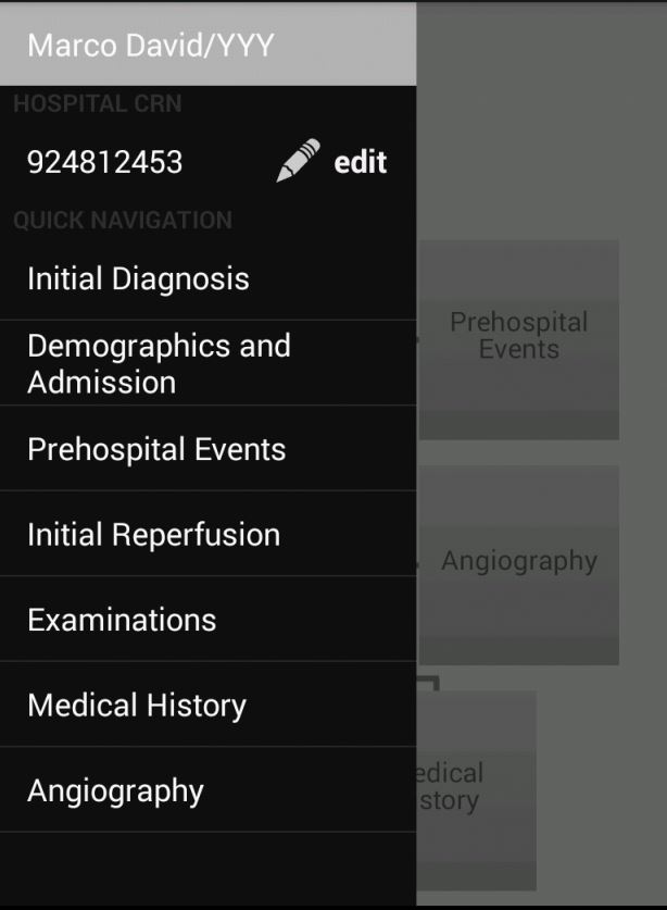
The app provides excellent navigation supports. Both an easy navigation side bar and a navigation page are offered to user. For those who are new to our app, they can easily find their way by using the familiar navigation page, for those who want quickly switch from page to page, the navigation bar will meet their need.
The navigation page

The navigation bar
Users should not have to wonder whether different words, situations, or actions mean the same thing. Follow platform conventions.
In order to make the user as comfortable as possible, the app inherited the way user input the information from the old web solution, the ratio button, drop down list, the types of the fields were all kept as they were.
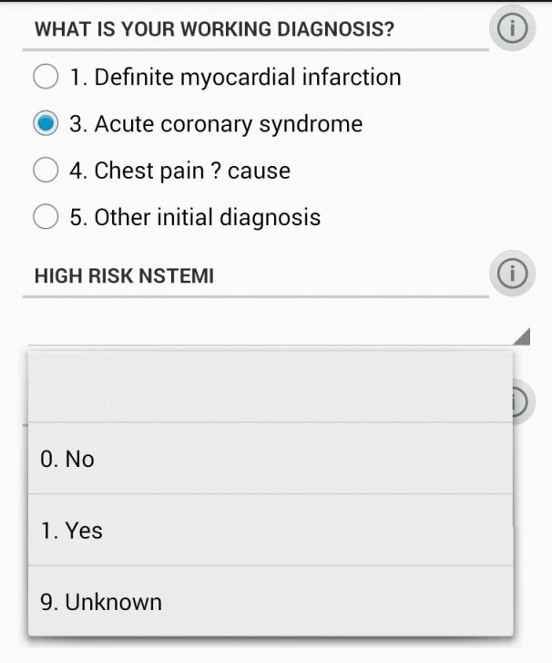
Even better than good error messages is a careful design which prevents a problem from occurring in the first place. Either eliminate error-prone conditions or check for them and present users with a confirmation option before they commit to the action.
The log out and create new record functions both will discard the current record, in order to prevent user mistakenly touched those buttons and lose their input, a warming sign will pop up to confirm whether user wants to proceed.
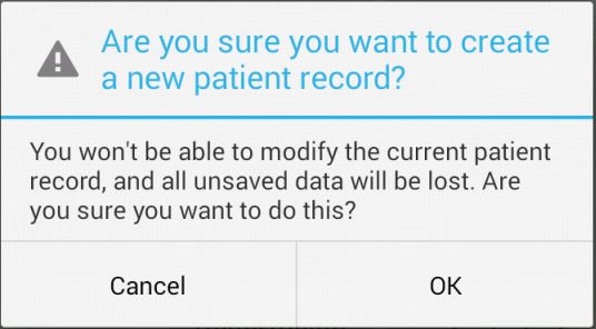
Minimize the user’s memory load by making objects, actions, and options visible. The user should not have to remember information from one part of the dialogue to another. Instructions for use of the system should be visible or easily retrievable whenever appropriate.
In case the user need help with understanding certain fields, most of the fields are come with notes, if you click the exclamation mark next to the field name, the note which contains explanation for the field will appear.
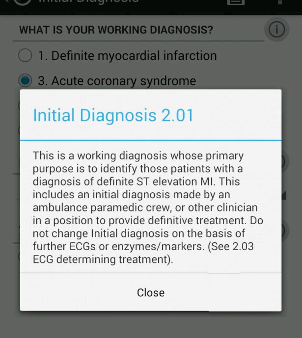
Accelerators — unseen by the novice user — may often speed up the interaction for the expert user such that the system can cater to both inexperienced and experienced users. Allow users to tailor frequent actions.
The reason why the app has two navigation methods is not only the new user could get use to the app very quickly(with navigation page), but also those experienced user, who wants be more efferent, could switch from page to page more quickly(with navigation bar).
Throughout this project, I’ve been mostly involved with the back-end logic and design, and though my “share” has its importance, in the end it is the user interface that will be presented to our end users. Having said that, using the mobile application was, for this particular user, a painless experience.
There is familiarity in the way the application is presented. As of this writing, our application is not complete; yet I can’t help but make parallels between the existing web application and our solution. The way input is asked from the user is identical on both applications: radio buttons, drop-down lists, text / date fields are all included, work and (for the most part, given the reduced working space) are presented in the same order. Functionally, our solution works as the web application does. A record needs only four fields be filled in order to be saved, but provides enough fields to complete six full information pages.
The overall design of our solution is, for lack of a better term, aesthetically sound. There are no elements that go unused or misused, everything on the screen is there for a clear reason. Furthermore, the design is clean. Colours are used sparingly, but contrast well when needed (especially on radio button selection).
Navigation has remained faithful to the web application as well. Next and Back buttons work on our app as they do online, keeping a linear approach. Yet the addition of a drawer navigation object will allow for faster navigation and data input for those users that may be more experienced than most. Slight reminders or visual cues, the clearest one being having to scroll down to the end of the page in order to continue, make for a more user friendly experience.
As a final note, it should be pointed out that this application is meant for medical professionals. As such, terminology is not suited for all users. Tooltips also will only help those that are familiar with MINAP and their web application.
I haven’t quite had the time to update this blog over the holiday season and since our last client meeting due to large amounts of Android coding. I can however safely say that all the outlined interactions have been implemented in its final form, pending hooking up to David’s back-end. The app should currently serve its main purpose as a tool to gather feedback on the concept of data collection for MINAP on a mobile phone.
A run-through of how our app functions will be outlined in a future video, but here’s a collage of screenshots to update you on the progress of the overall interactions the user can have with the app (note: for clarity, many pages have been left out):

And just to show how closely the Android app resembles the initial paper prototypes:
Today we had our first meeting (since breaking for the holiday) with our client with a working prototype of our Android app. Again, comments on the app were generally positive, with some minor nitpicks on functionality (the realm of product specifications). I did however bring up the idea of porting the app to a tablet interface, seeing how our survey indicated the current use of tablets (iPads) in some hospitals.
Once again, the navigation drawer was the topic of conversation – however, this time it was much more positive. Our client was willing to scrap the navigation map in favour of a persistent navigation drawer, as it served the purpose of navigation much better. One thing to note however, is that the navigation map also serves as an indicator of page completion in the web app, changing the colours of each box, depending on completion status.
This did however get me thinking about a possible tablet interface that gave the best of both worlds.
The current Android app (screenshots will be available in future posts…) scales the input boxes and value labels to the screen width, and the navigation map should also scale to the phone size. This works well for phones, where the extra real estate is welcome – however, this looks terrible on a larger tablet screen, creating extremely long lines of text and wasted space for data entry pages.
The extra space would ideally be used to contain data entry fields in separate ‘columns’, more akin to the current web app. However, to properly implement this would require another iteration of design – which we can’t afford the time to do. However, some quick prototypes of possible tablet layout designs are suggested below:
The primary view would consist of a persistent navigation drawer, with the navigation map taking up most of the screen real estate – similar to the current web view.
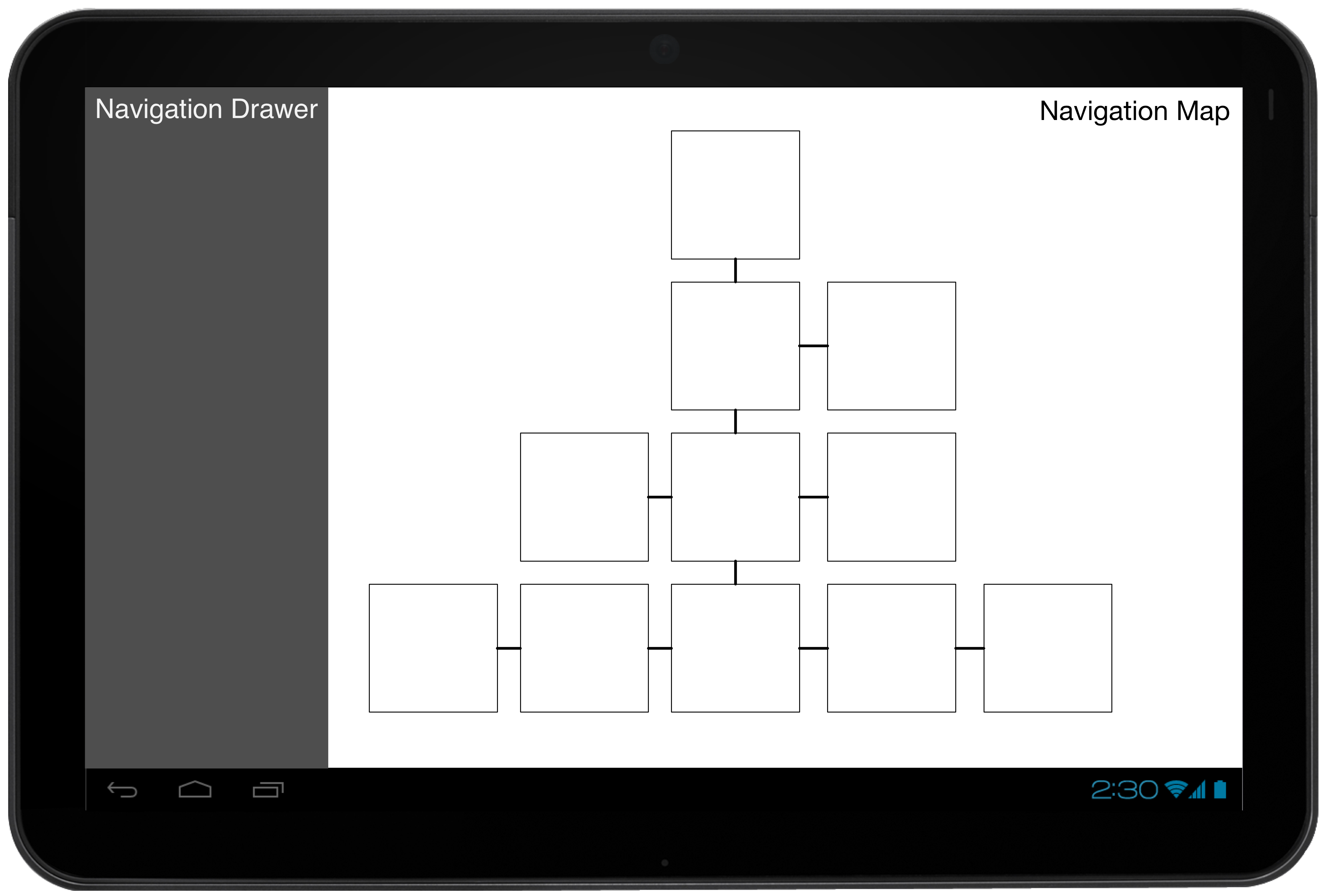
The ‘fragment’ containing the navigation map would be replaced when navigating into a data entry page, showing a view (also) very similar to the web app.
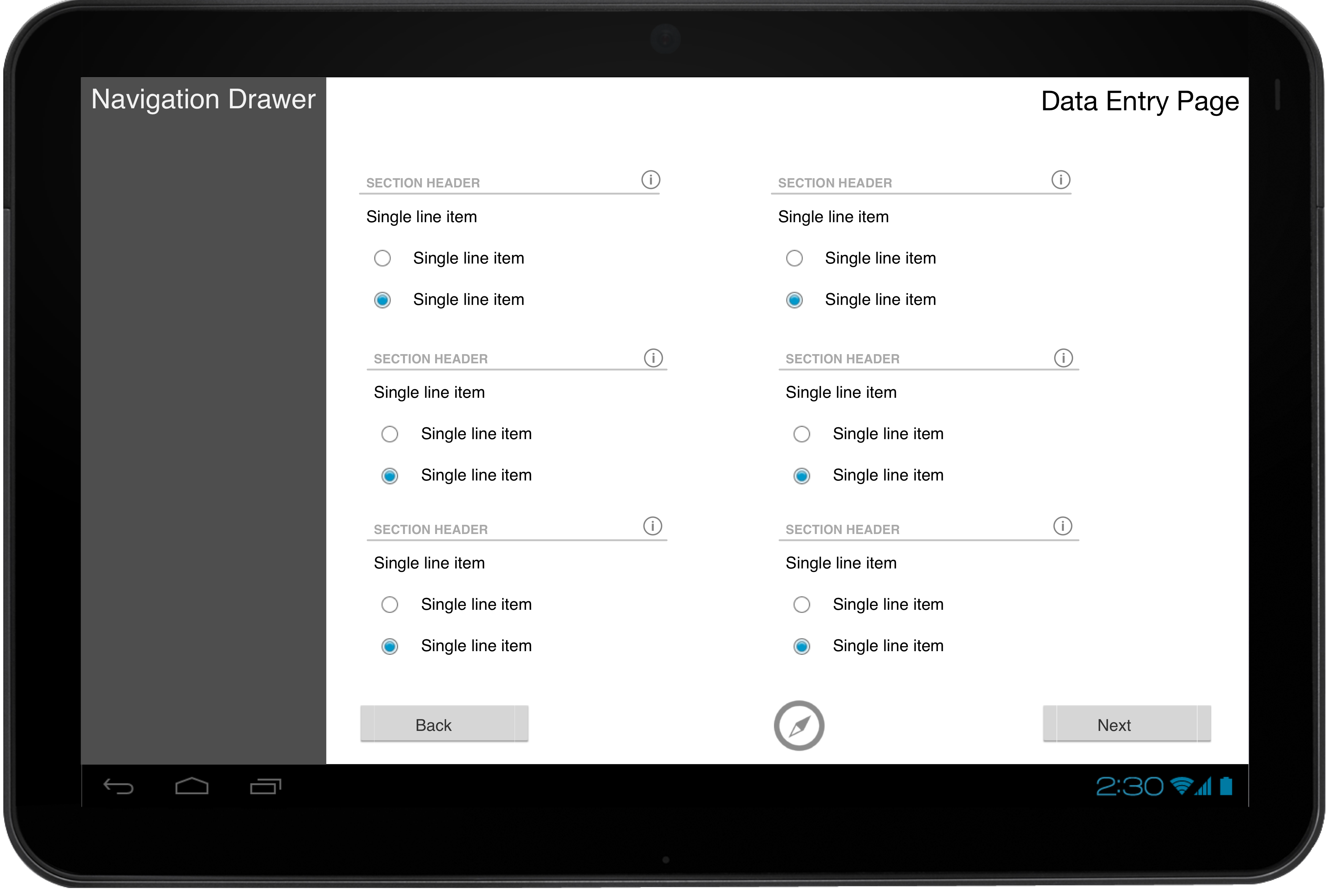
The design process for our app to best fit a tablet view evidently boils down to just mimicking the current web app interface. Future work on this should be fairly straightforward (layouts can be separated to allow for this).
During the early development phases, David made several sketches of a preliminary UI to show to our client to ensure we had captured all the functionality that we had agreed on. The focus was more on functionality, rather than specific UI decisions, since we had yet to nail down our target mobile platform. The client was happy with our design decisions – with some suggestions for functionality – but our requirements have significantly changed since then, and we now have a mobile platform that we have decided to stick to (Android). Despite this, much of the new UI design is based off these preliminary sketches.
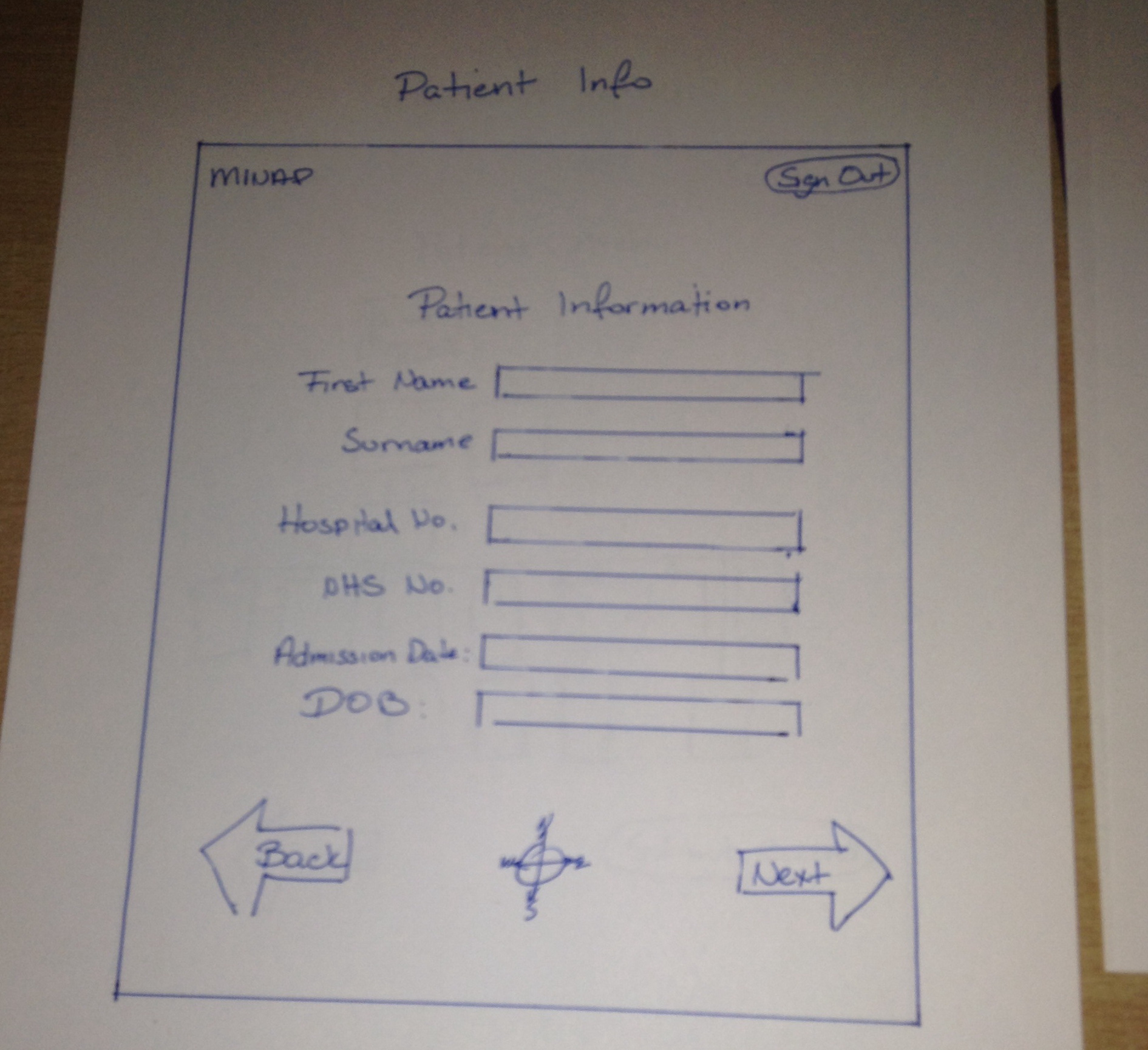
To help with the redesign, I took over the process of creating the new GUI, and started off with a clean slate (piece of paper).
I printed out several templates (made in MS Word) around the size of a typical Android smartphone’s screen to keep myself within the constraints of a phone. The black bar at the bottom is meant to represent Android’s “soft buttons” for navigation on newer phones without menu keys built into the hardware (as seen on the developer website under the heading “System Bars”). For this case, phones with the soft navigation bar primarily differ from older phones (like the Nexus S) in that they move the roles of the hardware “menu” button to an “overflow” soft-button on the Android action bar. I assumed the newer behaviour when designing the interface.
Based on the information I gleaned from the Android developer website, I started to piece together a rough idea of a mobile interface for MINAP. The purpose of this initial sketch was as a personal brainstorming session – the notes aren’t meant to be legible to anybody else.
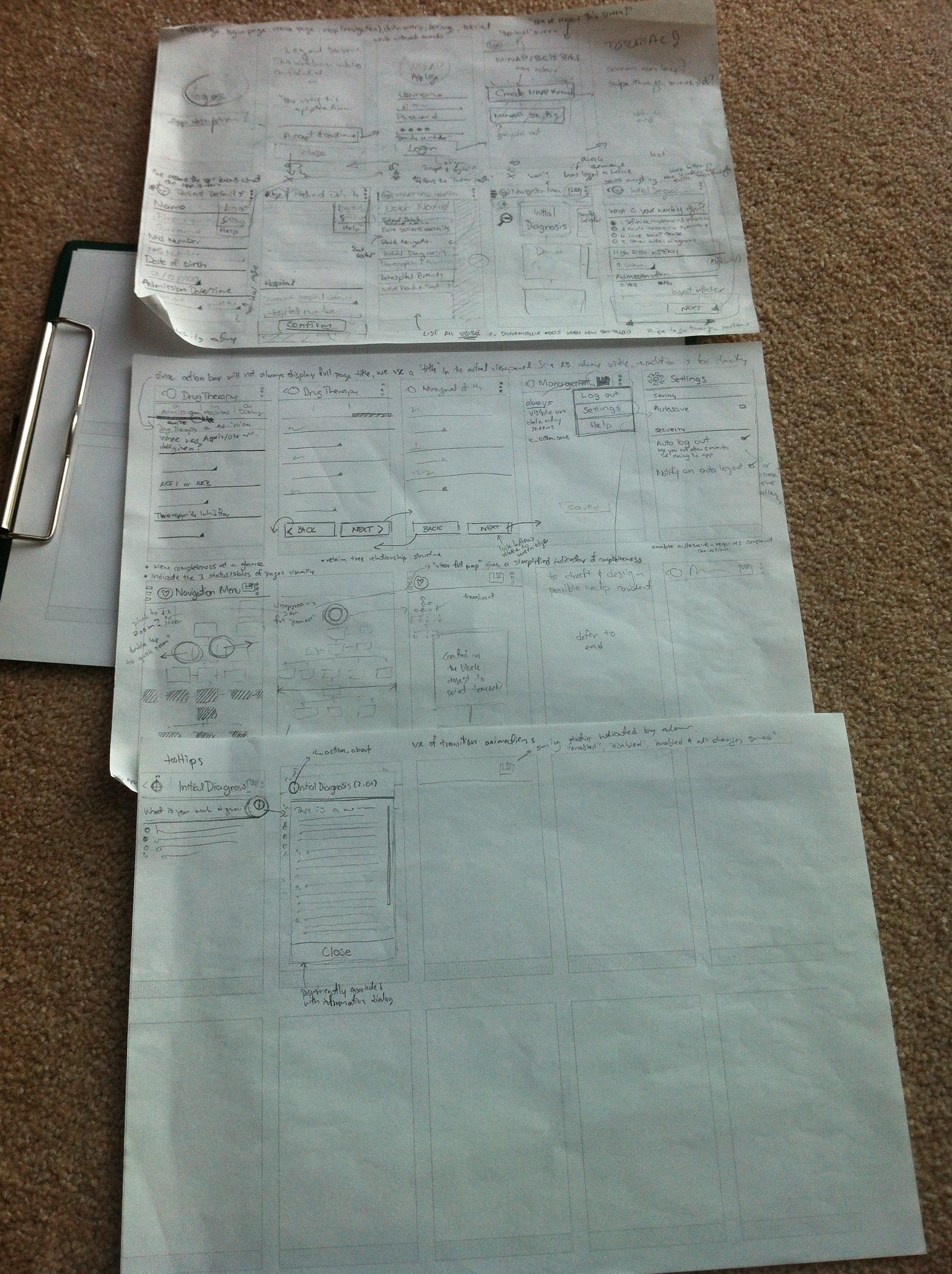 The process of starting the app and logging in was initially designed to closely match the current web app’s interface. The legal disclaimer, login screen, and the options menu to create a new record was included to make the longtime MINAP user comfortable with the interface.
The process of creating a record would first prompt the user to enter in patient details, with a button labelled “Confirm”, to give weight to the importance of information entered on that page. As mobile screens rarely give signifiers for scrolling (unlike most desktop interfaces), confirmation and navigation buttons are located at the bottom of the page’s content. This forces the average user to view all data entry fields before progressing further, hopefully helping with data completeness.
The concept of using a navigation drawer to give feedback on the current session and “quick navigation” is also explored here. The navigation drawer would animate in from the left when the user transitions into the navigation page from touching the “Confirm” button (on Patient Details). Since the navigation drawer is typically hidden with (few) visual signifiers, this acts as both a reminder and introduction of its existence.
The overflow button (3 vertical dots) should be used for less-used features, such as logging out, settings, and help. Ideally, we would like to have the “Log out” option more prominently displayed, but space on the action bar is at a premium, and is used for more important tasks such as saving (classic floppy icon). More concerned users such as Edward are however more likely to explore the app in its entirety. Despite this, I’ve explored the option of “auto log out” as a default in the settings. There are however implications of making this a default behaviour (e.g. data loss), so the concept should be explored a bit more.
In the future, the navigation map would be pretty big, so I’ve explored some methods of manipulating the map with touch inputs as well.
As a final touch, I’ve tried to get a feel on how the help tooltips would be represented in the mobile app. The current web app uses a question mark for its icon, but I figured that since most users of a mobile version would likely be new to MINAP data entry, a more widely used “i” for “information” would be better recognised.
To ensure I was making reasonably informed decisions with the UI, I redrew my preliminary sketches whilst consciously culling unnecessary features.
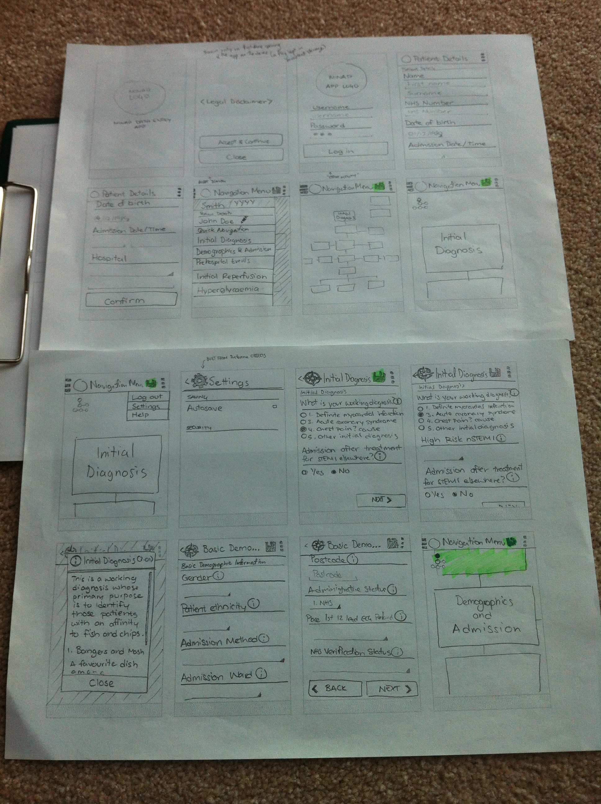
One of the major changes I made was the culling of the page where users are given the option to create a record or a ‘stub’. To help with the focus of our app on record creation, we should remove all options that may deviate away from this core purpose. Creating patient record stubs could instead be handled in a more streamlined fashion (automated, perhaps) to avoid the users from making a mistake of choosing the wrong option on first opening the app.
The concepts about keeping navigation buttons at the end of the page previously discussed can be seen more clearly in the photo below. Information buttons are also clearly associated with each value label, triggering a dialog box which can be easily dismissed with a clearly labelled button.
My sketches, though more legible was still not quite in a state that would allow me to clearly illustrate my ideas for the mobile interface to our client. To better do this, I had to employ the power of technology – and a bit of magic (i.e. imagination).
A rather nifty app that helped with this process was “POP” (Prototyping on Paper). The app is an Android/iOS solution to converting paper prototypes to semi-functional Wizard of Oz prototypes. Unfortunately, the Android version was very buggy, so I had to create my pseudo-app on an iPhone – hence the added imagination.
It’s somewhat hard to describe how exactly I transformed the sketches into an interactive prototype, so I’ll let the video below demonstrate.
The fake ‘swiping’ on the Patient Details page was intentional, as the app only allows capturing touches on bounding boxes. This was pretty much how I presented the app to our client – using a bit of magic to convince our client it was running on an Android device (I think it worked…).
Having a tangible product to show to the client helped with getting more concrete feedback. The comments from our client were pretty positive overall, with some key points of concern:
Despite the concerns about the navigation drawer, I think the concept would probably be better demonstrated with an actual working prototype. Although our client had a go at ‘running’ our app, it was limited in scope due to the input limitations of the system. I aim to continually gather client feedback once we have a semi-functional app running on Android.
I’ve owned an Android smartphone for three years before switching over to a hand-me-down iPhone, and went through Gingerbread and Ice Cream Sandwich(4.0). Having spent the first 2 years dealing with Gingerbread, switching to the new interface of Android 4.0 was a breath of fresh air. ICS introduced a cleaner UI with a clearer design language. Our decision to only support devices from ICS onwards are primarily due to security concerns, but the availability of more (intuitive) UI elements and ways to present our app is really just the icing on the cake.
To get a clearer idea of the UI elements available to us, I had a look through the official Android UI website, identifying the main elements available for use. This was just a very brief run through, as I realised the documentation regarding the recommended use of the elements by Google were quite thorough – which I intend to constantly refer to throughout the building of the app UI.
Platform specific UI patterns of interest (images taken from the Android developer website:
 The action bar acts as a persistent UI pattern that can be used across all pages. Less important functionality such as Logging out could be kept in the ‘overflow’ (3 vertical dots) menu, and key features such as saving could use prominent icons (the classical floppy disk). The icon (labelled 1) for ancestral navigation could also be made contextual, such that it could change to be a compass icon when the user navigates to a data entry page.
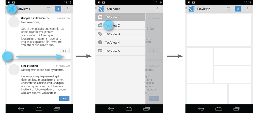 Our mobile app’s key purpose is to allow for quick data collection at the point of contact with the patient. With tech savvy users such as Julie, we would like to include as many time-saving shortcuts to frequently accessed features as possible. The navigation drawer could be introduced as an alternative way to navigate around the pages, as opposed to constantly visiting the navigation map. The typical way of navigation (according to our client) involves the user ‘hopping’ around different pages when entering information (making the back and next buttons redundant – but we are keeping them for familiarity). A good use of the drawer would be to allow quick navigation around pages, as well as maybe giving the user feedback on who they are logged in as, and who the current patient being recorded is.
To create a truly native application that users of the mobile platform can easily navigate, I figured that I needed to understand the common design language of the operating system (OS). So in preparation for mapping information and navigation of the current MINAP web app onto Android, I had a look through the official design principles of Android OS. At first glance, the Android design principles don’t seem to relate to our medical data entry app at all (“delight me in surprising ways”?), but specific points can be picked out. From the three main principles (Enchant me, Simplify my life, Make me amazing), some outlined sub-principles of the document can be taken onboard in the design of the app:
Although the core content of the app cannot be changed due to the precise nature of medical data input, we can keep our tutorials short with simple language
Breaking down the tasks of using the application strikes me as an area which we could improve on the current app, with a wealth of possible options available to me upon opening the web app. If we expect the app to have more widespread usage, the process of record creation should be fairly intuitive to someone with limited prior knowledge.
There are two main ‘modes’ which our user would be most active in during use: navigation mode, and page data entry mode. It should be clear how the user will navigate back and forth through the app, allowing for multiple possible ways (i.e. back button, or a navigator icon)
Due to security concerns and data protection, we shouldn’t retain a local copy of entered data beyond the duration of the session. Despite this, we could ‘autosave’ the entered data into a ‘draft’ database on the central server, with visual indicators to let the user know the data has been submitted for storing (the expected web app behaviour is manual saving).
We should keep in mind what we mean when using Android UI elements (i.e. if it looks like a text box, it should act like one) to ensure they retain the same meaning throughout the app.
Gestures such as swiping from the edge for menus aren’t good for a primary interface due to discoverability issues for novice users, but can serve to speed up the workflow of more experienced users.
When informing the user of validation errors, it would be helpful to consider if the warnings could be reworded for clarity and ‘niceness’.
The ability to switch between pages and the mode of data entry and navigation should be effortless. It should also be relatively easy to check details of the session such as the current logged in username and patient core details.
To make UI decisions easier, I will be aiming to follow these principles as closely as possible in conjunction with the core Android UI elements and more detailed design guidelines which I hope to cover in a future post.
Medical data entry applications are a new concept (and also likely to be distributed solely within the company), so direct competitors are hard to come by on all major mobile app stores. One element of our app solution that could be used as a basis for finding similar solutions is the navigation panel. On a 1024 x 768 desktop browser, the user can easily read all the text and possible pathways at a glance. Directly mapping this onto a small device (smartphone) would yield unreadable text if naively shrunk to fit the screen; enabling a simple zoom-in and out approach would require too much scrolling in arbitrary directions to view the complete navigation map.
To get some ideas on how we could best represent this tree-navigation structure, we had a look through the apps on our own smartphones. Interestingly enough, a language learning app had the closest representation of the current MINAP navigation tree.
Duolingo, a language learning mobile app, relies on a central ‘learning tree’ to show the user’s progress of language learning. The user progresses through different levels, clearly separated by horizontal rules, containing individual units of activities.
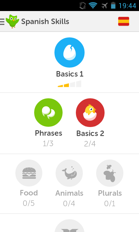
Each unit is an icon, associated with a short description of its associated meaning. Colour is used to signify the ability to access the units: with greyscale to mean inactive, and a coloured icon to mean active. User progress in the units are indicated as well, through use of fractions and ‘level bars’ (which is puzzling), using colours and greyscale again to indicate level of completeness. As with most modern designs, Duolingo has done away with scroll bars to signify the ability to scroll downwards, but overcomes this problem by having an icon ‘peeking’ out from the bottom of the screen – indicating that there is more content below.
Due to the working environment that our app would be used in, we need to ensure a professional look – so we can’t use vibrant colours and iconography as extensively as Duolingo. However, the use of very distinct colours to indicate level of completeness and access could be adopted for quick recognition of the completion ‘status’ of each page on the navigation map, to suit the quick nature of patient record creation intended in our mobile app. The current (MINAP) web app employs the same colouring strategy, though using more subtle hues, compatible with the more relaxed and slow process of data entry at the computer.
Additionally, the organisation of levels in Duolingo lack a sense of coherence, with the utilitarian grey divider not conveying any sign of connection between the different levels. The MINAP web app has the problem of dealing with ‘levels’ containing up to 7 pages, which unfortunately won’t fit with Duolingo’s method of mapping.
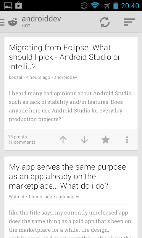
Reddit Sync is a (3rd-party) mobile client app for a popular online community sharing website, Reddit. Its primary purpose is for consuming content quickly and giving feedback on posted content by votes or comments. The app makes heavy use of the card metaphor, with card metadata and actionable items prominently featured.
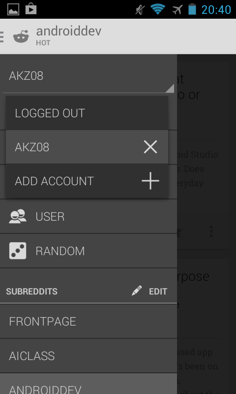
What I found most interesting about Reddit Sync however, was its use of the Android navigation drawer. Reddit is divided into separate interest groups/sections called ‘subreddits’, which contain posts related to a particular topic. These sections are analogous to the pages in the MINAP dataset, and could be used as a quick alternative way (a navigation list) to traverse through the many pages.
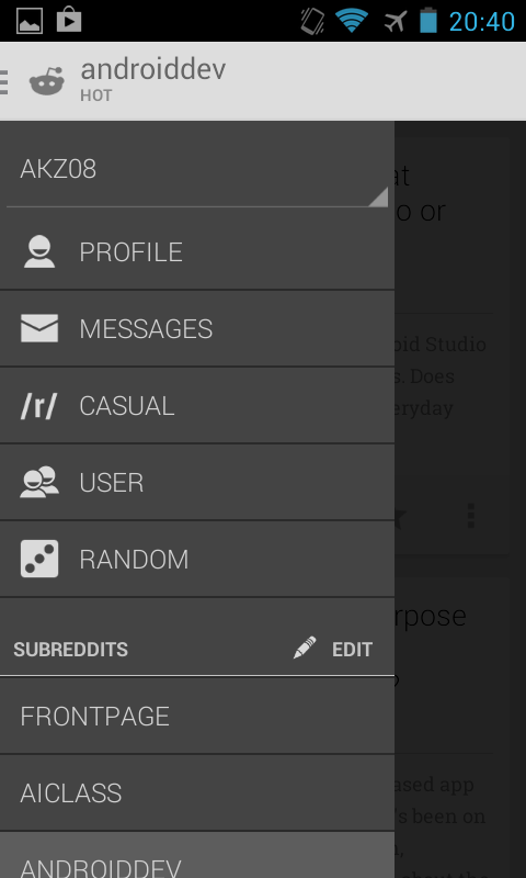
One other interesting feature is how the app deals with multiple logins. It is common practice on Reddit for users to manage multiple accounts for their different online personas. Reddit Sync prominently displays your currently logged in username at the top of the navigation drawer, with a ‘spinner’ – an Android signifier indicating the ability to choose between several options. Touching this spinner allows the user to switch between accounts on the fly. Such an interface could be useful in the near future to allow MINAP users to switch between accounts registered to different hospitals under their name.
