Android UI Elements
I’ve owned an Android smartphone for three years before switching over to a hand-me-down iPhone, and went through Gingerbread and Ice Cream Sandwich(4.0). Having spent the first 2 years dealing with Gingerbread, switching to the new interface of Android 4.0 was a breath of fresh air. ICS introduced a cleaner UI with a clearer design language. Our decision to only support devices from ICS onwards are primarily due to security concerns, but the availability of more (intuitive) UI elements and ways to present our app is really just the icing on the cake.
To get a clearer idea of the UI elements available to us, I had a look through the official Android UI website, identifying the main elements available for use. This was just a very brief run through, as I realised the documentation regarding the recommended use of the elements by Google were quite thorough – which I intend to constantly refer to throughout the building of the app UI.
Platform specific UI patterns of interest (images taken from the Android developer website:
Action Bar
 The action bar acts as a persistent UI pattern that can be used across all pages. Less important functionality such as Logging out could be kept in the ‘overflow’ (3 vertical dots) menu, and key features such as saving could use prominent icons (the classical floppy disk). The icon (labelled 1) for ancestral navigation could also be made contextual, such that it could change to be a compass icon when the user navigates to a data entry page.
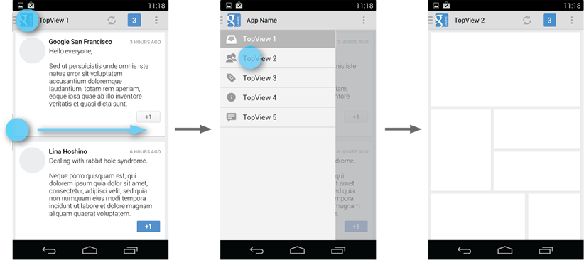
Navigation drawer
 Our mobile app’s key purpose is to allow for quick data collection at the point of contact with the patient. With tech savvy users such as Julie, we would like to include as many time-saving shortcuts to frequently accessed features as possible. The navigation drawer could be introduced as an alternative way to navigate around the pages, as opposed to constantly visiting the navigation map. The typical way of navigation (according to our client) involves the user ‘hopping’ around different pages when entering information (making the back and next buttons redundant – but we are keeping them for familiarity). A good use of the drawer would be to allow quick navigation around pages, as well as maybe giving the user feedback on who they are logged in as, and who the current patient being recorded is.


