Playing With Paper
Standing on the shoulders
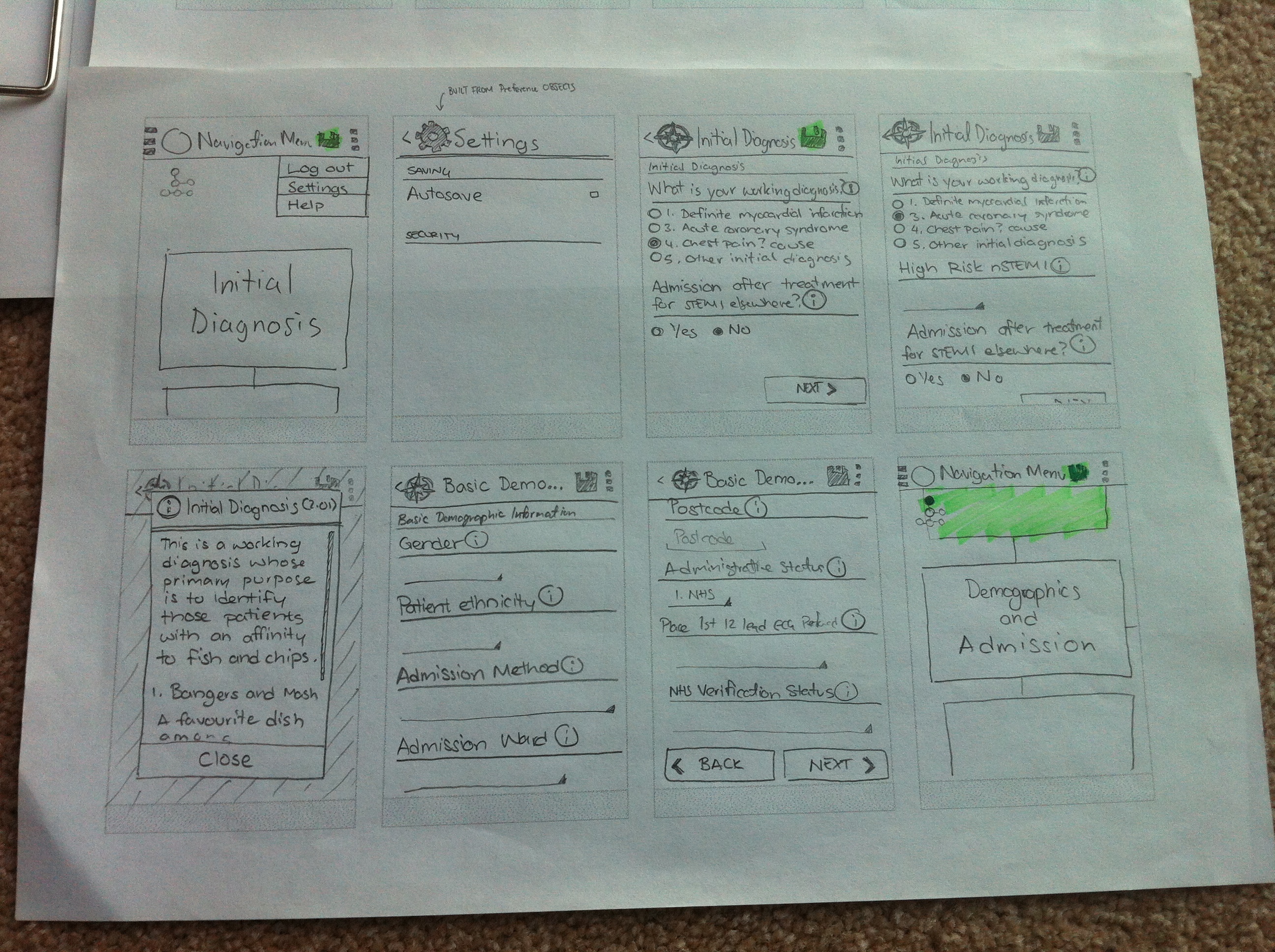
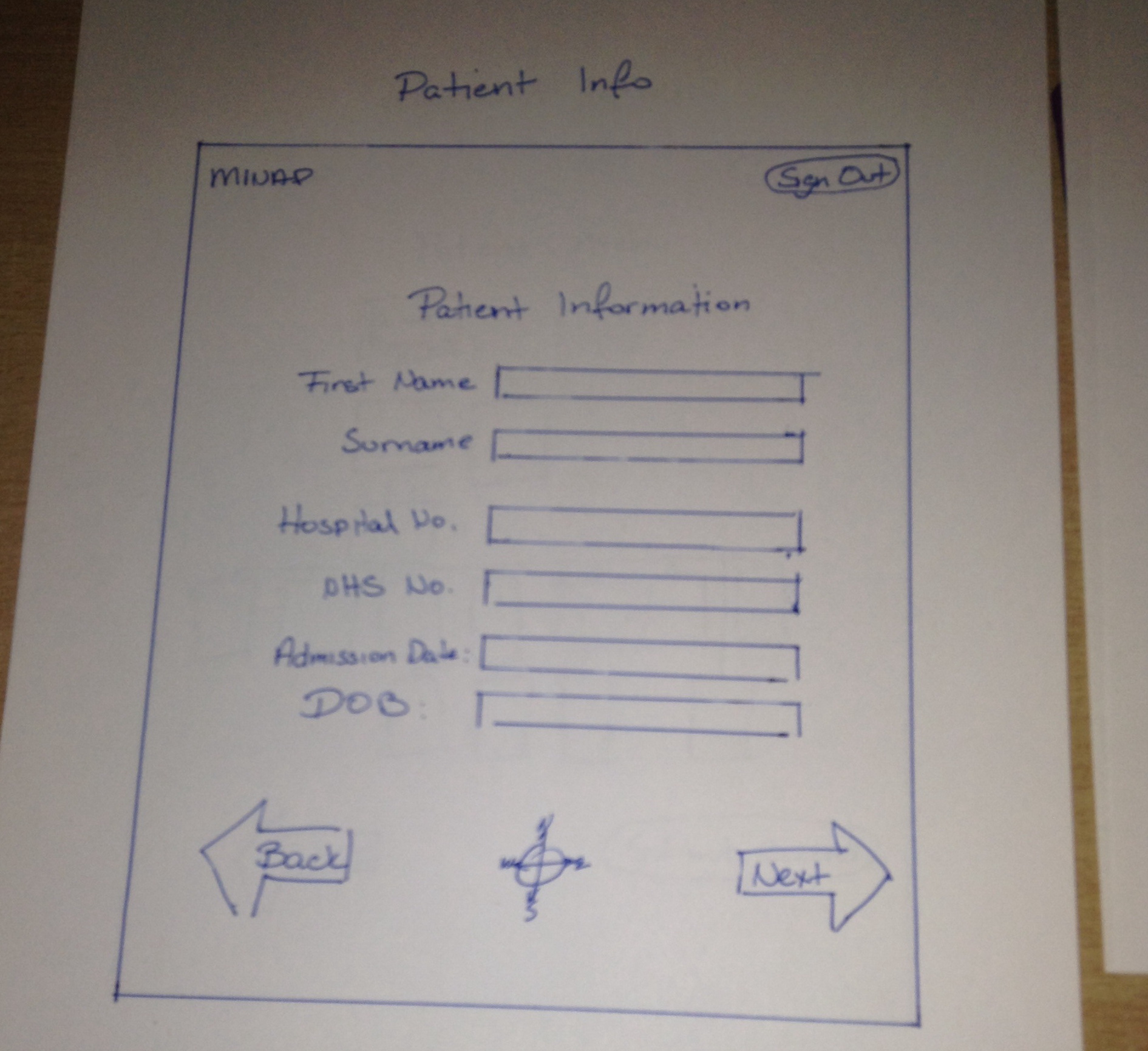
During the early development phases, David made several sketches of a preliminary UI to show to our client to ensure we had captured all the functionality that we had agreed on. The focus was more on functionality, rather than specific UI decisions, since we had yet to nail down our target mobile platform. The client was happy with our design decisions – with some suggestions for functionality – but our requirements have significantly changed since then, and we now have a mobile platform that we have decided to stick to (Android). Despite this, much of the new UI design is based off these preliminary sketches.
New beginnings
To help with the redesign, I took over the process of creating the new GUI, and started off with a clean slate (piece of paper).
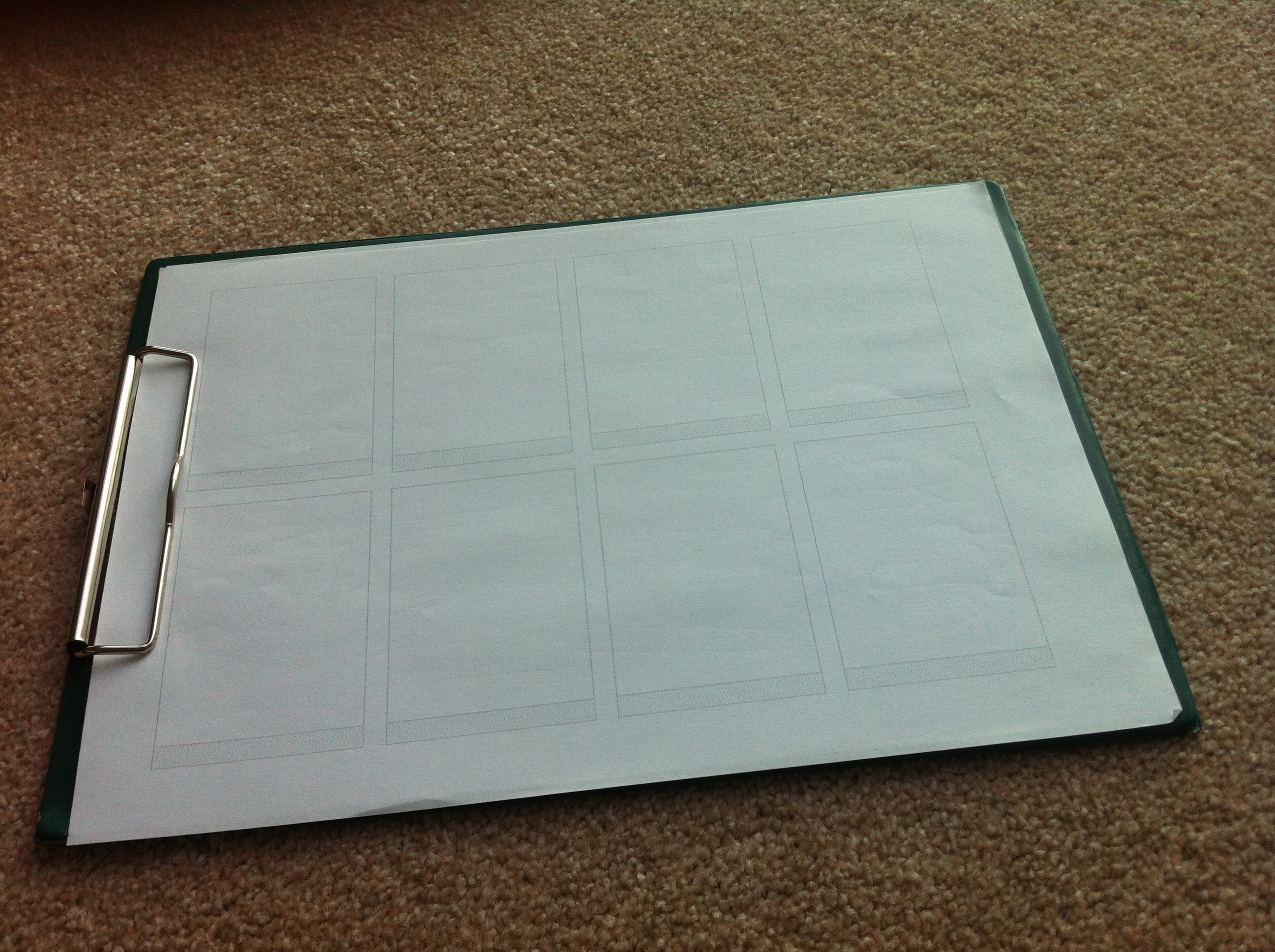
I printed out several templates (made in MS Word) around the size of a typical Android smartphone’s screen to keep myself within the constraints of a phone. The black bar at the bottom is meant to represent Android’s “soft buttons” for navigation on newer phones without menu keys built into the hardware (as seen on the developer website under the heading “System Bars”). For this case, phones with the soft navigation bar primarily differ from older phones (like the Nexus S) in that they move the roles of the hardware “menu” button to an “overflow” soft-button on the Android action bar. I assumed the newer behaviour when designing the interface.
First steps
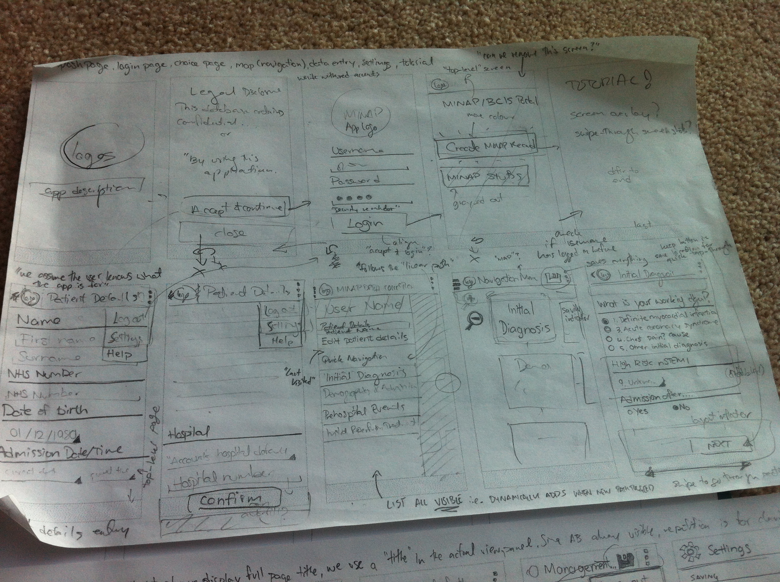
Based on the information I gleaned from the Android developer website, I started to piece together a rough idea of a mobile interface for MINAP. The purpose of this initial sketch was as a personal brainstorming session – the notes aren’t meant to be legible to anybody else.
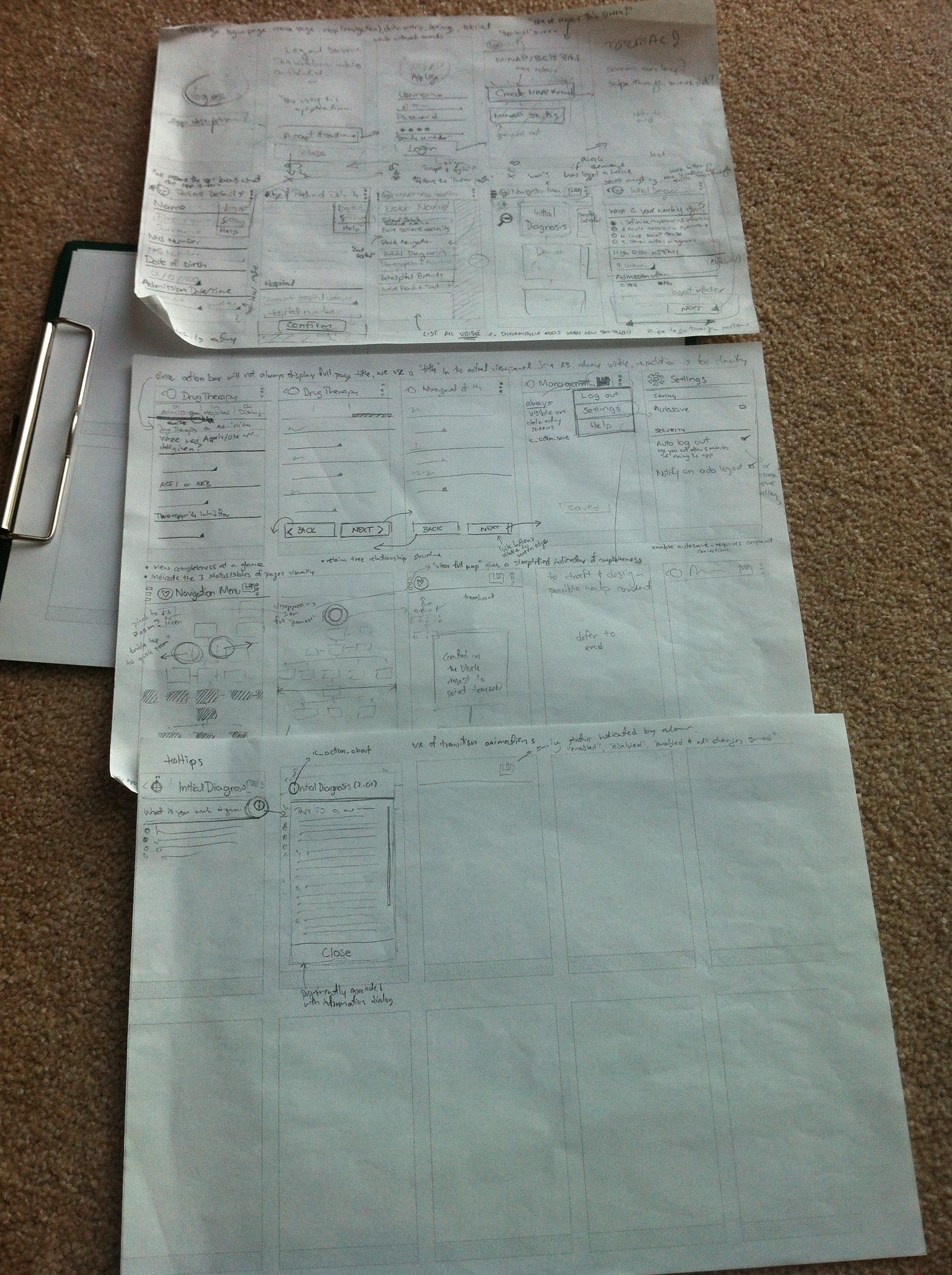 The process of starting the app and logging in was initially designed to closely match the current web app’s interface. The legal disclaimer, login screen, and the options menu to create a new record was included to make the longtime MINAP user comfortable with the interface.
The process of creating a record would first prompt the user to enter in patient details, with a button labelled “Confirm”, to give weight to the importance of information entered on that page. As mobile screens rarely give signifiers for scrolling (unlike most desktop interfaces), confirmation and navigation buttons are located at the bottom of the page’s content. This forces the average user to view all data entry fields before progressing further, hopefully helping with data completeness.
The concept of using a navigation drawer to give feedback on the current session and “quick navigation” is also explored here. The navigation drawer would animate in from the left when the user transitions into the navigation page from touching the “Confirm” button (on Patient Details). Since the navigation drawer is typically hidden with (few) visual signifiers, this acts as both a reminder and introduction of its existence.
The overflow button (3 vertical dots) should be used for less-used features, such as logging out, settings, and help. Ideally, we would like to have the “Log out” option more prominently displayed, but space on the action bar is at a premium, and is used for more important tasks such as saving (classic floppy icon). More concerned users such as Edward are however more likely to explore the app in its entirety. Despite this, I’ve explored the option of “auto log out” as a default in the settings. There are however implications of making this a default behaviour (e.g. data loss), so the concept should be explored a bit more.
In the future, the navigation map would be pretty big, so I’ve explored some methods of manipulating the map with touch inputs as well.
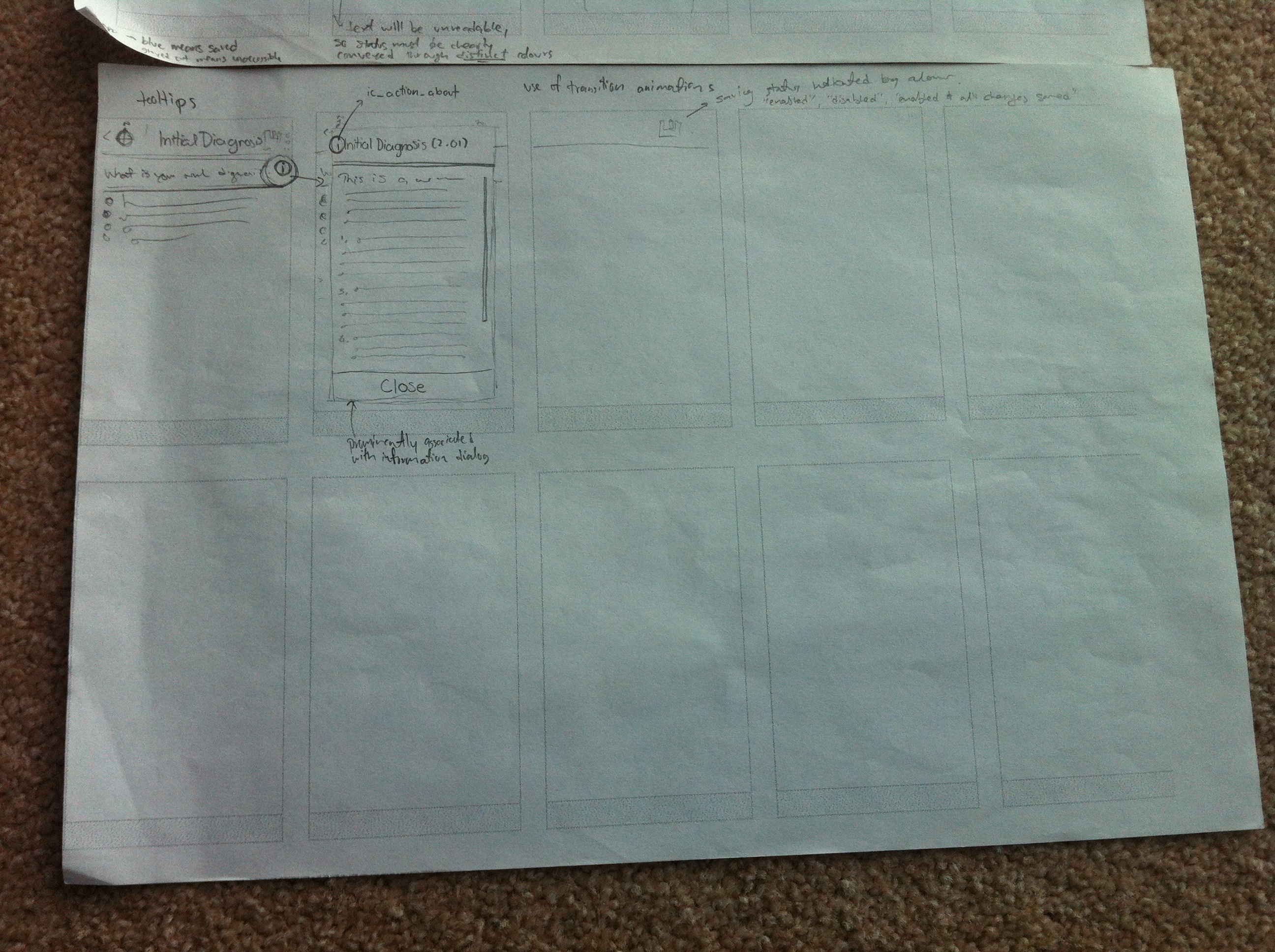
As a final touch, I’ve tried to get a feel on how the help tooltips would be represented in the mobile app. The current web app uses a question mark for its icon, but I figured that since most users of a mobile version would likely be new to MINAP data entry, a more widely used “i” for “information” would be better recognised.
Cleaning up
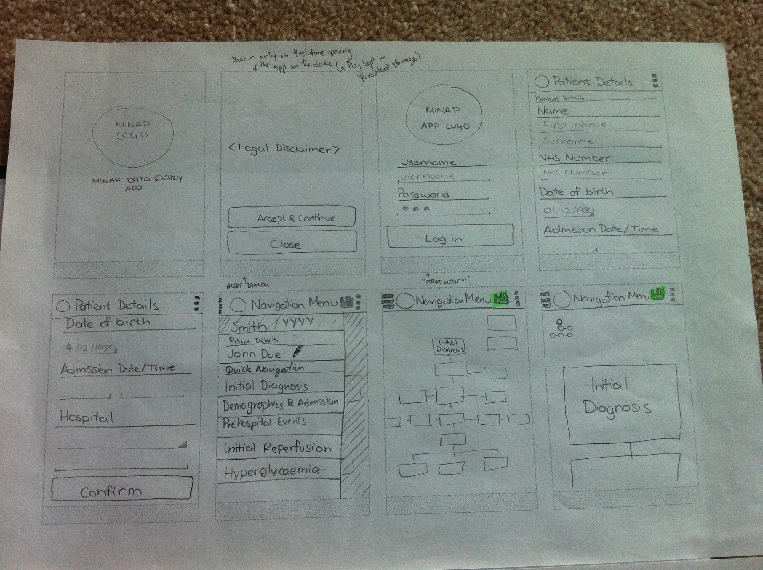
To ensure I was making reasonably informed decisions with the UI, I redrew my preliminary sketches whilst consciously culling unnecessary features.
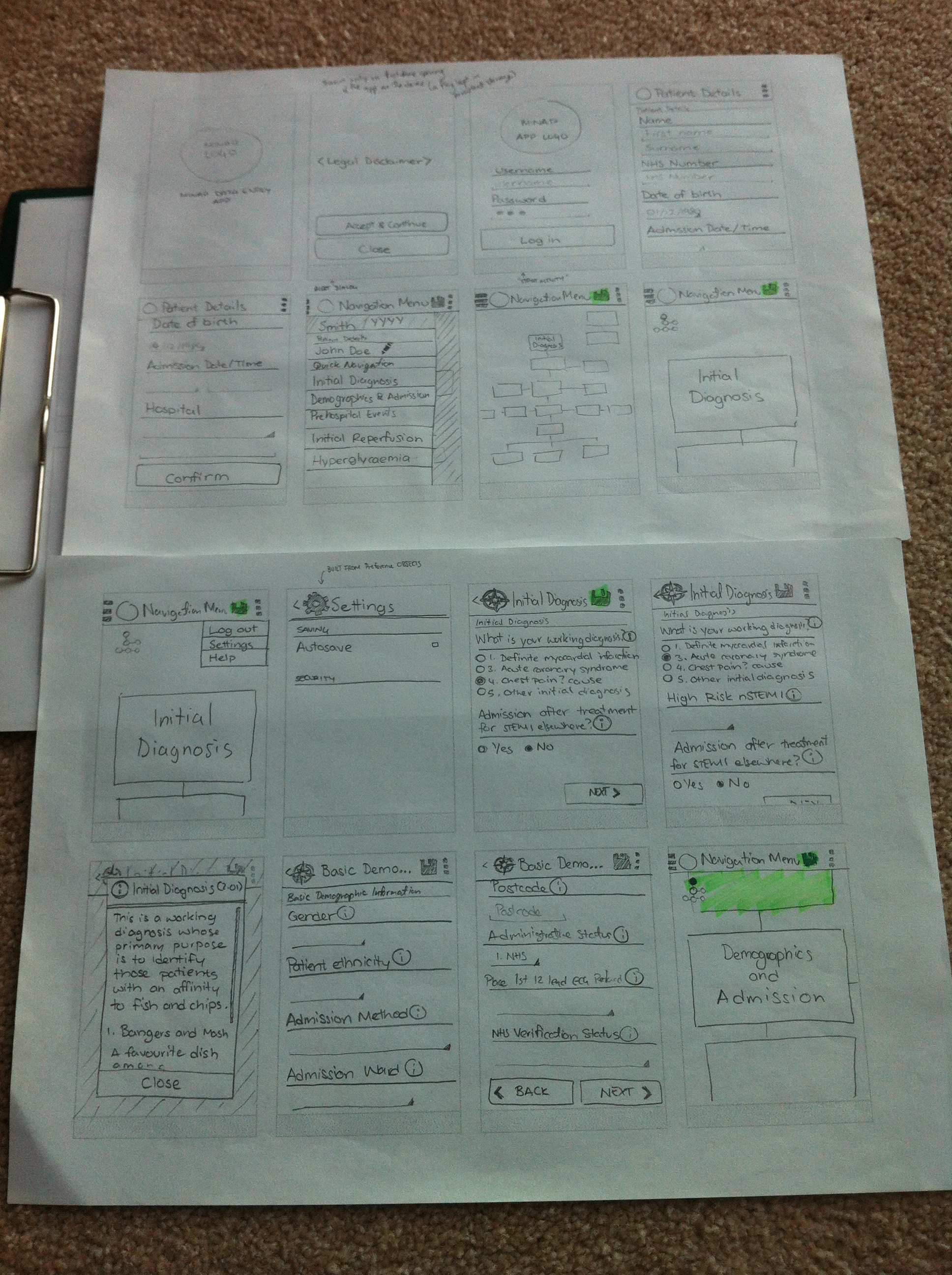
One of the major changes I made was the culling of the page where users are given the option to create a record or a ‘stub’. To help with the focus of our app on record creation, we should remove all options that may deviate away from this core purpose. Creating patient record stubs could instead be handled in a more streamlined fashion (automated, perhaps) to avoid the users from making a mistake of choosing the wrong option on first opening the app.
The concepts about keeping navigation buttons at the end of the page previously discussed can be seen more clearly in the photo below. Information buttons are also clearly associated with each value label, triggering a dialog box which can be easily dismissed with a clearly labelled button.
My sketches, though more legible was still not quite in a state that would allow me to clearly illustrate my ideas for the mobile interface to our client. To better do this, I had to employ the power of technology – and a bit of magic (i.e. imagination).
A touch of magic
A rather nifty app that helped with this process was “POP” (Prototyping on Paper). The app is an Android/iOS solution to converting paper prototypes to semi-functional Wizard of Oz prototypes. Unfortunately, the Android version was very buggy, so I had to create my pseudo-app on an iPhone – hence the added imagination.
It’s somewhat hard to describe how exactly I transformed the sketches into an interactive prototype, so I’ll let the video below demonstrate.
The fake ‘swiping’ on the Patient Details page was intentional, as the app only allows capturing touches on bounding boxes. This was pretty much how I presented the app to our client – using a bit of magic to convince our client it was running on an Android device (I think it worked…).
Getting feedback
Having a tangible product to show to the client helped with getting more concrete feedback. The comments from our client were pretty positive overall, with some key points of concern:
- despite owning an Android phone herself, she had not encountered the use of the navigation drawer before
- she would really appreciate a tutorial for less experienced users (we will if time permits…)
Despite the concerns about the navigation drawer, I think the concept would probably be better demonstrated with an actual working prototype. Although our client had a go at ‘running’ our app, it was limited in scope due to the input limitations of the system. I aim to continually gather client feedback once we have a semi-functional app running on Android.
