Trying to Be Responsive
Client feedback
Today we had our first meeting (since breaking for the holiday) with our client with a working prototype of our Android app. Again, comments on the app were generally positive, with some minor nitpicks on functionality (the realm of product specifications). I did however bring up the idea of porting the app to a tablet interface, seeing how our survey indicated the current use of tablets (iPads) in some hospitals.
Once again, the navigation drawer was the topic of conversation – however, this time it was much more positive. Our client was willing to scrap the navigation map in favour of a persistent navigation drawer, as it served the purpose of navigation much better. One thing to note however, is that the navigation map also serves as an indicator of page completion in the web app, changing the colours of each box, depending on completion status.
This did however get me thinking about a possible tablet interface that gave the best of both worlds.
How responsive is enough?
The current Android app (screenshots will be available in future posts…) scales the input boxes and value labels to the screen width, and the navigation map should also scale to the phone size. This works well for phones, where the extra real estate is welcome – however, this looks terrible on a larger tablet screen, creating extremely long lines of text and wasted space for data entry pages.
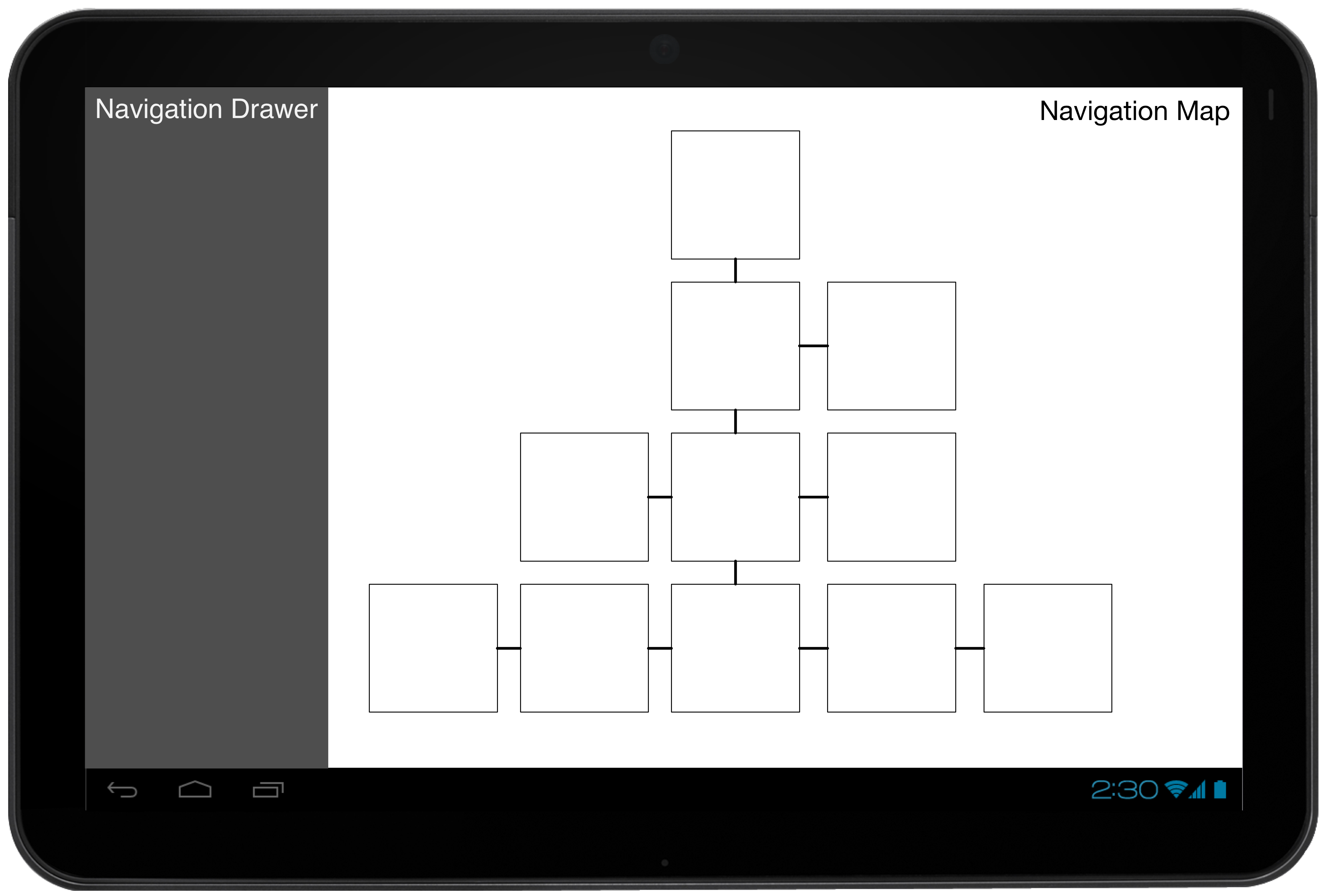
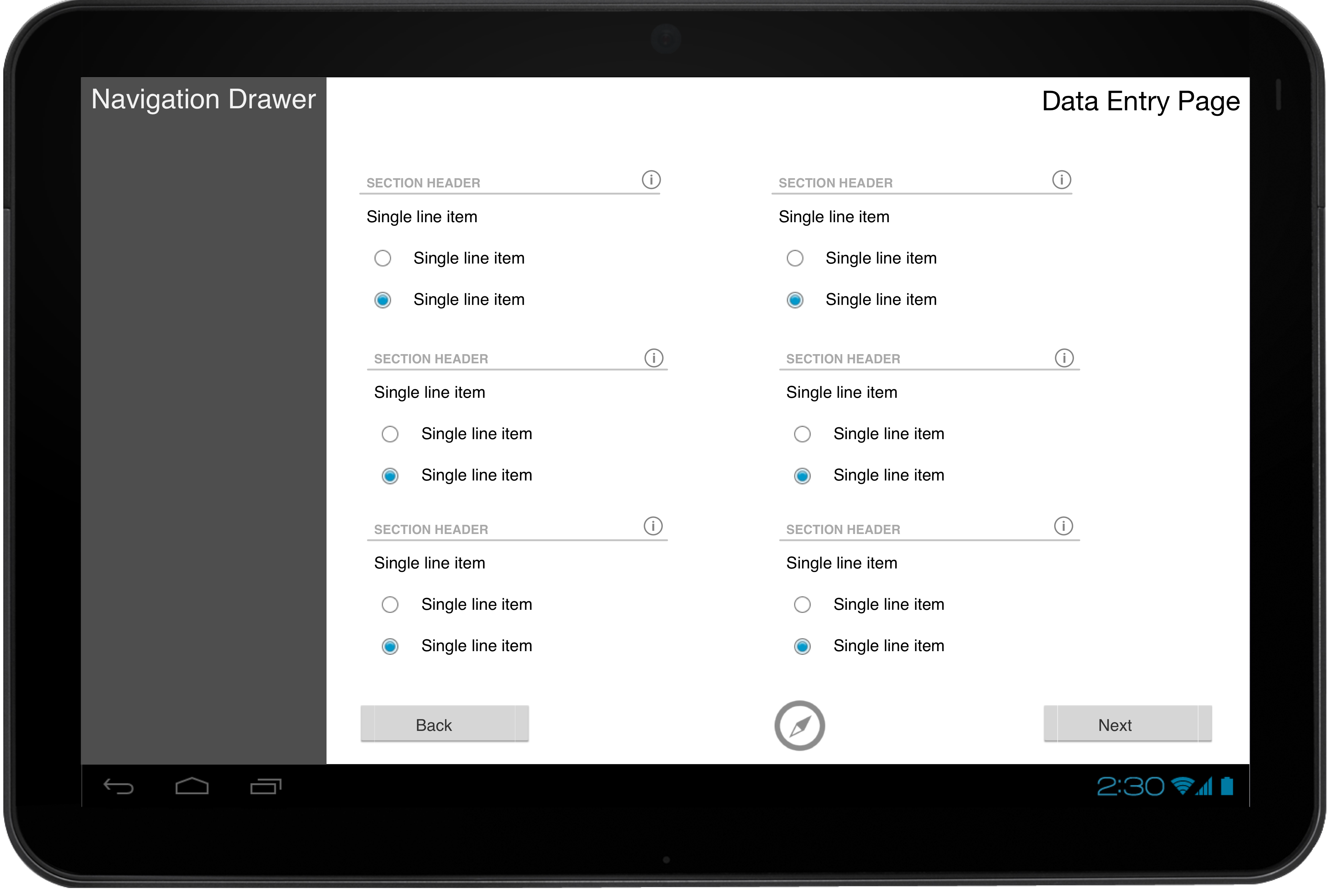
The extra space would ideally be used to contain data entry fields in separate ‘columns’, more akin to the current web app. However, to properly implement this would require another iteration of design – which we can’t afford the time to do. However, some quick prototypes of possible tablet layout designs are suggested below:
The primary view would consist of a persistent navigation drawer, with the navigation map taking up most of the screen real estate – similar to the current web view.

The ‘fragment’ containing the navigation map would be replaced when navigating into a data entry page, showing a view (also) very similar to the web app.

The design process for our app to best fit a tablet view evidently boils down to just mimicking the current web app interface. Future work on this should be fairly straightforward (layouts can be separated to allow for this).


