Ke's Heuristic Evaluation
The following evaluation is based on Nielsen’s 10 principles of heuristic evaluation:
Visibility of system status (Feedback)
The system should always keep users informed about what is going on, through appropriate feedback within reasonable time.
Selection
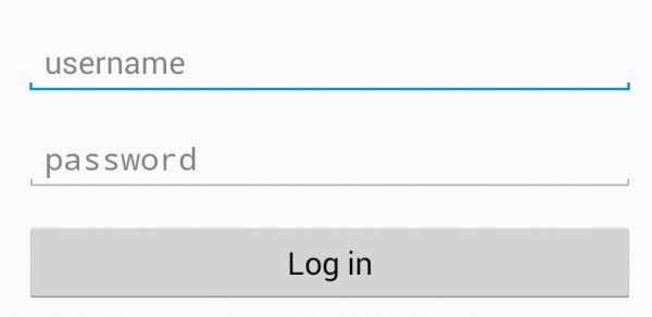
The box that was clicked by user will be highlighted with blue line, makes it easier for user to know where they have selected
Save indicator
A feedback message is displayed when an action is performed, in case, when save button is clicked, the app will save completed fields and give feedback to user.

Match between system and the real world(METHAPHOR)
The system should speak the users’ language, with words, phrases and concepts familiar to the user, rather than system-oriented terms. Follow real-world conventions, making information appear in a natural and logical order.
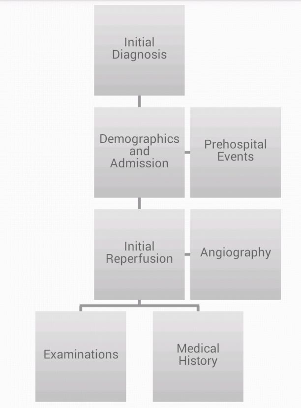
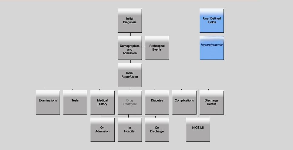
The design of navigation page on the app is very similar to the one that the current MINAP web solution has, expect the simplified structure, the essential feature which is the tree diagram was kept, and the logical relations between pages are inherited as well. For those who are new to our app, they can easily find their way by using the familiar navigation page.
Navigation page on the app
Navigation page on the old web solution
User control and freedom (NAVIGATION)
Users often choose system functions by mistake and will need a clearly marked “emergency exit” to leave the unwanted state without having to go through an extended dialogue. Support undo and redo.
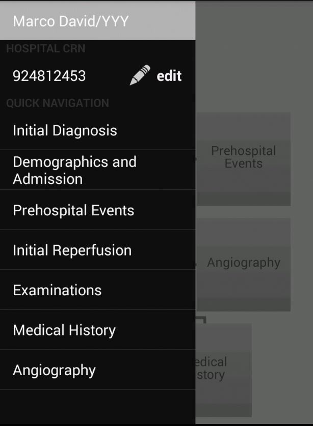
The app provides excellent navigation supports. Both an easy navigation side bar and a navigation page are offered to user. For those who are new to our app, they can easily find their way by using the familiar navigation page, for those who want quickly switch from page to page, the navigation bar will meet their need.
The navigation page

The navigation bar
Consistency and standards
Users should not have to wonder whether different words, situations, or actions mean the same thing. Follow platform conventions.
Input method
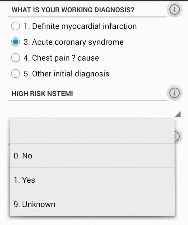
In order to make the user as comfortable as possible, the app inherited the way user input the information from the old web solution, the ratio button, drop down list, the types of the fields were all kept as they were.
Error prevention
Even better than good error messages is a careful design which prevents a problem from occurring in the first place. Either eliminate error-prone conditions or check for them and present users with a confirmation option before they commit to the action.
The log out and create new record functions both will discard the current record, in order to prevent user mistakenly touched those buttons and lose their input, a warming sign will pop up to confirm whether user wants to proceed.

Recognition rather than recall
Minimize the user’s memory load by making objects, actions, and options visible. The user should not have to remember information from one part of the dialogue to another. Instructions for use of the system should be visible or easily retrievable whenever appropriate.
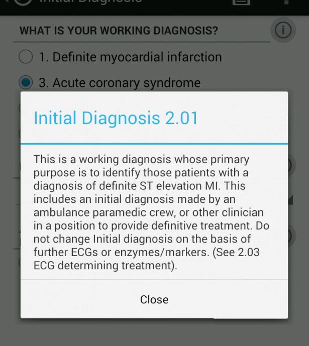
In case the user need help with understanding certain fields, most of the fields are come with notes, if you click the exclamation mark next to the field name, the note which contains explanation for the field will appear.
Flexibility and efficiency of use
Accelerators — unseen by the novice user — may often speed up the interaction for the expert user such that the system can cater to both inexperienced and experienced users. Allow users to tailor frequent actions.
The reason why the app has two navigation methods is not only the new user could get use to the app very quickly(with navigation page), but also those experienced user, who wants be more efferent, could switch from page to page more quickly(with navigation bar).


